The Surname-ı Hümayun is the first masterwork of the Ottoman surname tradition. Sur (Imperial Celebration) and Surname (Book of Imperial Celebration) are traditions unique to the Ottomans. The first officially recorded imperial celebration is the imperial wedding of the daughter of Sultan Osman I, in 1258. Pictorial depictions in Surnames begin with a particular Sur, namely the circumcision feast of Sultan Murad's son Mehmed. Adorned by the miniatures of the master court painter, Nakkaş Osman, the scenes in the Surname-i Hümayun depict the circumcision feast of the son of Sultan Murad, which lasted fifty-five days.
The original text of the Surname is written by a court author, using the pseudonym Intizami and is edited by the official chief secretary of the Imperial court, Seyit Lokman. The miniatures depict the various stages of the ceremony in constructed story line and portray the prosperity of the 16th century Ottoman Empire.
The images here are from the Book of Festivities that was commissioned under Sultan Murad III in 1582/83.
https://commons.wikimedia.org/wiki/Category:Surname-ı_Hümayun
When Mucha gives you a box of biscuits
Mucha was a regular artist for Lefèvre-Utile, the major French biscuit company founded in Nantes in 1846. He designed publicity posters and calendars for them and in 1896 was the first artist to utilise the company’s initials ‘LU’ as a decorative motif with his design for the advertising calendar for 1897. Around 1900 Mucha’s task was expanded to packaging design, which included labels, box tops and the decoration of biscuit tins.
For Mucha, packaging design meant the decoration of objects (products) by applying art to their forms in order to enhance their charm and character. Therefore, as he wrote later, he thought that art should serve as a language to the object to be decorated. This idea is demonstrated in the message carried by the biscuit boxes: the moment of happiness and comfort, as illustrated in the insets, as well as the quality of the products, which is enhanced by the box decorated with the borders emphasising solidity and dignity. Also Mucha produced a ‘brand’ with the use of a consistent font, logo and decorative formula, which linked the packaging with the publicity.
http://muchafoundation.org/en/gallery/themes/theme/packaging-design/object/56
Bradbury Thompson
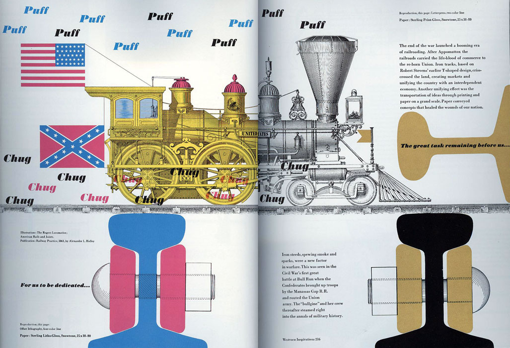
The pictures are from my own collection. They are scans from a book that I bought for the university years ago when I was putting together material for the history of visual communication course. Not exactly legal, I know, but I am very glad I had the foresight to do it anyway, since when I made a search for Brad Thompson's work online just now I was astonished by how slim the pickings were. Definitely one of the greatest graphic designers of the last 100 years, and very relevant in his style to graphic design today. And yet it seems that he is slowly being forgotten. Am I very surprised? Sadly no. So much of what was relevant only a few years is now being relagated to the ranks of "Curio", little oddities to soon be forgotten about entirely. So, why not a giant like Brad Thompson also?
There is a good text on his life and work that you can read here: https://www.rit.edu/carycollection/bradbury-thompson
There is a good text on his life and work that you can read here: https://www.rit.edu/carycollection/bradbury-thompson
Kittl: A site that lets you create vintage logos and labels
If you are a graphic designer who is suddenly confronted with having to design a retro logo or a label that asks for a no hold barred approach, needs every pattern, texture, flourish, all the typographic twists and turns and curlicues - and all correctly placed, no less - you may be quite intimidated by the task at hand. I know, I certainly would be.
Kittl is a truly astonishing online app that lets you create these complex types of logos. You start with one of their templates and then modify it to the point where it becomes something that you can declare to be your own. I am not sure how the attributions and copyright issues work, one would need to look into that before one takes it further. I only played around a bit, and yes it truly is remarkable how well this works. And yes, I am aware of all the label creator mockup sites and such, this is in a completely different league to those.
And for that reason, I do not think that one can just wander in cobble something together with this. I do think that it needs some knowledge of graphic design history, particularly 19th century Americana and Victoriana, but also I think it needs an understanding of not only logo design but also label design of that period since most of these are based upon labels of that period.
Paper Dolls and Paper Theaters were favorite toys of the 19th Century
These are things that I collected over some time. So, unfortunately there is no resource link that goes with this post, except to direct you to pinterest > > > where you will find lots and lots of images which will however mostly link you back to places where they are selling them.


.jpeg)
.jpeg)