Map Typography from the early 20th Century

A selection of images from the blogpost entitled Sanborn Fire Insurance Map Typography published on the BibliOdyssey blog earlier this week in which title pages, headings and letterforms of maps issued between 1880 and 1920 by the Sanborn company are shown. The images below are from the Virginia map from October 1907 (top); the South Carolina map from June 1919 (middle); and the Washington DC map from1903 (bottom).


Bembo...

... is the name of the typeface which Francesco Griffo, working for the Aldine Press under Aldus Manutius, cut for Venetian scholar Cardinal Pietro Bembo in 1495.


One of the noteworthy things about Bembo is the  fascination which contemporary graphic designers show for this 500+ year old typeface. Below are an anonymous poster based upon Bembo (top), "Bembo Type Work" by *Xantiel (middle), and "Font Poster" by creativespirit18 (bottom); all found on a forum thread of ultrabold.net.


And of course no post on the influences of Bembo on contemporary graphic design would ever be complete without a link to that utter delight Bembo's Zoo:


ECM Music

Founded by producer Manfred Eicher in 1969, ECM has issued over a thousand albums spanning many idioms, including standard-setting jazz recordings by Keith Jarrett, Paul Bley, Jan Garbarek, Chick Corea, Pat Metheny, the Art Ensemble of Chicago and others:

Importantly, for the field of graphic design Ecm has also pursued a consistent visual language based upon an interpretation of Swiss Style in its album covers. Very clean typography, often coupled with very beautiful , minimalistic photographs... Unfortunately the ECM site shows only small thumbnails. However a google image search will give you nice results, 4 of which I have linked to here:


David Trautrimas


David Trautrimas takes the components of familiar household appliances and transforms them into ironic/iconic architectural landscape paintings such as top secret Cold War era military outposts or residential building sites. The images below are "Micro Re-Instigator" from the The Spyfrost series (top), "The Fishing Complex" (middle) and the "Coffee Pot Towers" (bottom) from the Habitat series.


The Visual Telling of Stories

http://www.fulltable.com/CA/index.htm: Fabulous resource on mid 20th century living, told through all kinds of visual material, mostly advertisements and editorial design. Here is what Chris Mullen has to say about his own site:

"Welcome to Chris Mullen's website, The Visual Telling of Stories. You can go to the main gate or shuffle about in the Samplers till you get some hang of the place. It was started in 1996. Material is added every day. It is far bigger than you could ever imagine. I don't blame you for backing out, with a polite cough. I'll never know."

And this is no exaggeration at all - the place is huge! But nonetheless nicely manageable through a clear menu which is separated into well defined categories, which will take you to wonders such as these:


Fashion Art by Daniel Widrig

Daniel Widrig studied architecture in Germany and the UK. After graduating from the Architectural Association in London with a Master’s Degree in Architecture and Urbanism in 2006 , he joined Zaha Hadid Architects where he worked on several major international projects. Since establishing his own studio in London, Widrig has been working on architectural concepts, products, objects and experimental furniture editions. His work has won several awards such as the FEIDAD Merit Award 2006, the Swiss Arts Award 2007. In 2008 Daniel Widrig won the Rome Prize. He is currently artist in residence at the German Academy, Villa Massimo in Rome.

Below are a few examples of Widrig's investigation into fashion art. The two images above are from the Escapism series (2010/11), shown at the Paris Fashion Week with Iris van Herpen and MGX. The image on the bottom is from the Crystallization series (2010) shown at the Amsterdam Fashion Week, again with Iris Van Herpen and .MGX.


Embroidery Samplers

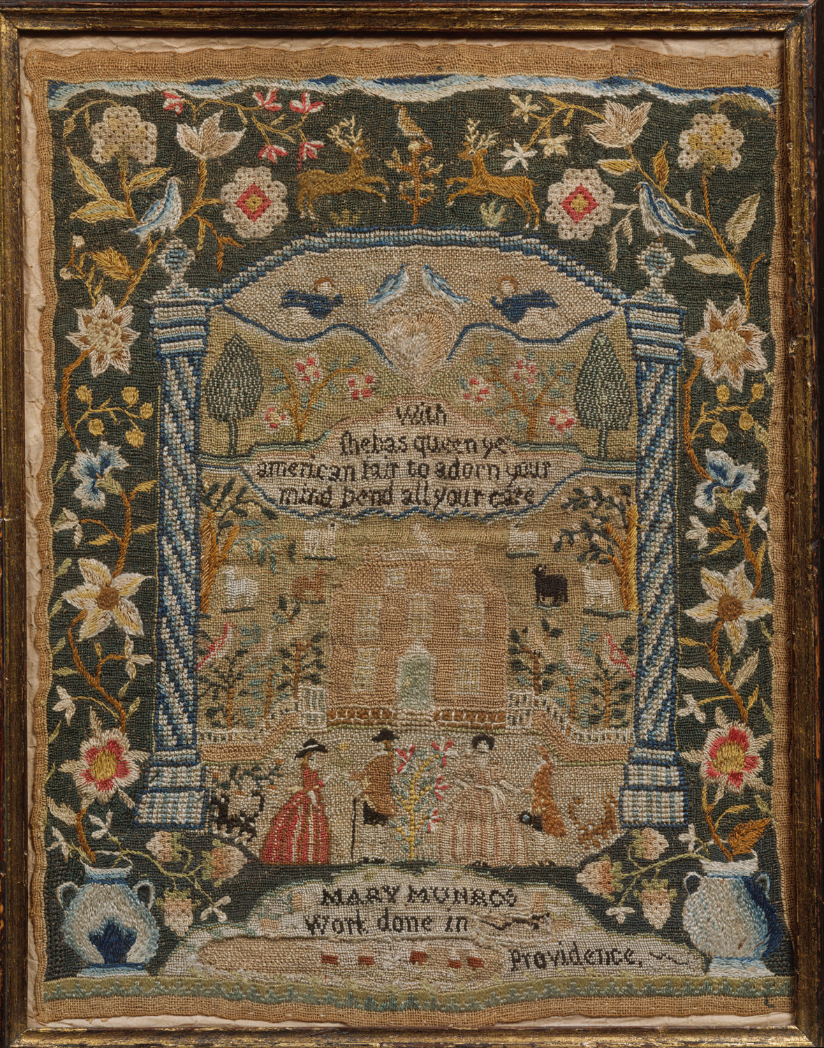
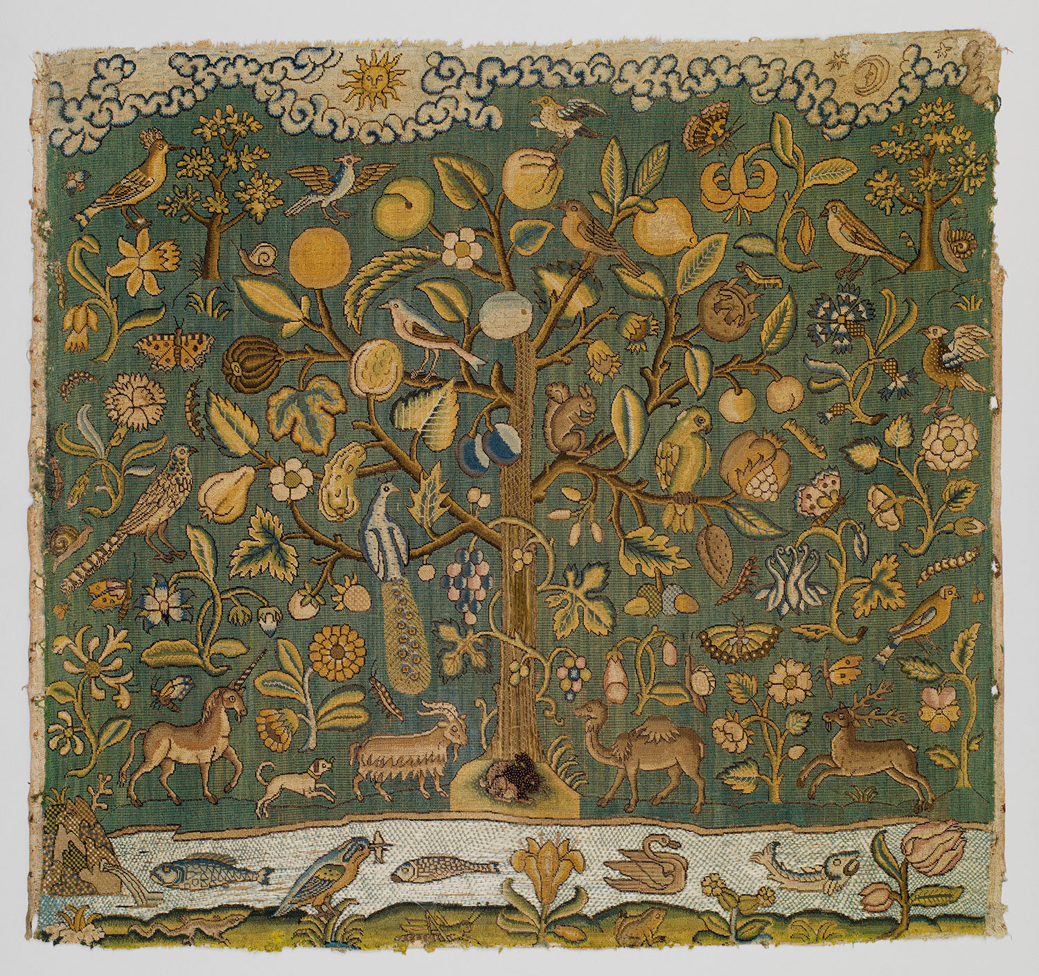
A needlework sampler is a piece of embroidery produced as a demonstration or test of skill in needlework. Samplers often include the alphabet, figures, motifs, decorative borders and sometimes the name of the person who embroidered them and the date.

The oldest surviving samplers were constructed in the 15th and 16th centuries. As there were no pre-printed patterns available for needleworkers, a stitched model was needed. Whenever a needlewoman saw a new example of a stitching pattern, she would quickly sew a small sample of it onto a piece of cloth - her 'sampler'. The patterns were sewn randomly onto the fabric as a reference for future use, and the woman would collect extra stitches and patterns throughout her lifetime.

A sumptuous collection of samplers can be found on the website of the Metropolitan Museum of Art, the under the Heilbrunn Timeline of Art History (a treasure trove, by the way!).

I am linking 3 of them to here: Rebekah White's sampler which is constructed out of silk on linen, ca. 1753 in Salem, Massachusetts (top); Mary Munro's sampler is also embroidered with silk onto linen, ca. 1785 at Miss Balch's School, Providence, Rhode Island (middle); and "The Tree of Life" sampler is from the first half of the 17th century, from England and is embroidered upon canvas with silk thread (bottom). (Please check out the page itself though, many more beauties to be seen).


Visual Complexity

Rigorously curated by its founder Manuel Lima, the Visual Complexity portal shows the very best output of a new hybrid profession between graphic design and computer science - Data Visualization:


A stunning blog: BibliOdyssey


To read from its header this is a blog on "books, illustrations, history, science, Visual Materia Obscura and eclectic book art". And is it ever! I have been looking and looking since I found it.

The blog takes its visual feed from a huge Flickr stream, of many many sets full of good sized images, covering all cultures and historic periods, with an emphasis on what can probably be called "curio"s of print. All of this is maintained by a gentleman from Sydney, who goes by the short name of Paul K. A generous person since his material has a creative commons license attached to it, which only asks that you attribute back to him!

I am linking only one image to here. It is a matter of either one or of hundreds, you see! So, you really have to go and check this out for yourselves! This one image is one of the covers of a series books entitled "The Eight Dog Chronicles" by Kyokutei Bakin (1767-1848).


Iranian/Persian Miniatures

I cannot get over the hierarchical structure in Persian miniatures where (in the absence of perspective) this effect is achieved solely through visual separators such as boxes and rules; often intricately placed inside each other or in overlapping layers - creating complex but very easy to navigate informational systems. And especially the way in which text and image is brought together... Of course, the same principles apply to all Islamic miniatures, including the Turkish ones. But putting all national possessiveness aside, I know that Persian Miniatures are the very cream of the crop!

I want to share a couple of links where I have seen some really good ones:

The first place is the Shogun Gallery (which incidentally is also great for Japanese Art). They will let you see a really nice big sized image, which is of course great! The following image is from their Persian Hall of Genre collection:


Second link is actually the category page on wikimedia commons for the Brooklyn Museum Collection, which is absolutely outstanding, and that is where the following two images come from:


The Periodic Table of Typefaces

This is a great project developed by Cam Wilde at squidspot.com. You can purchase prints and other memorabilia, such as vinyl decals or even a moleskine notebook cover, at a page dedicated to the table.

Cam Wilde tells us that "the Periodic Table of Typefaces is obviously in the style of all the thousands of over-sized Periodic Table of Elements posters hanging in schools and homes around the world. This particular table lists 100 of the most popular, influential and notorious typefaces today", based upon the download/sales data of some very well known type foundries.

Here is the full table:


Steampunk Typography

One problem when writing a post on Steampunk is how to label it correctly: Does one use the label "19th Century" or "21st Century" or both? Again, would this genre go under "Victoriana" or "Computer"?

It seems to me that all of the above would have to apply: Although Steampunk, as an art and design movement is contemporary and is also often computer based through its wide usage in game design, the inspiration comes from the era of steam, the 19th Century. I will probably post more on Steampunk (which I find highly relevant/successful as an intrinsically postmodernist approach to design) in the future. For now, I want to stick to Steampunk typography:


CCA Advertisements for Fortune Magazine

Throughout the 1930's and 1940's the Container Corporation of America ran a series of mostly black and white advertisements in Fortune Magazine. Designed by the likes of Cassandre, Kepes and Herbert Bayer, these ads are nothing less than landmarks of modernist design.

Of the images below, the upper advert is either by Herbert Bayer or Kepes; in the upper middle we have one by Herbert Bayer; the lower middle is by Cassandre; and finally at the bottom we have a beauty which is anonymous due to an unclear signature. Please go to Rare Posters to view the collection which they carry.


When Mucha sends you a postcard...

I live in dread of the Cartamania site going out of existence one day since it has not been updated in over 2 years now. This is one of the greatest places that I have come across for things such as postcards from the 19th century, as well as all kinds of other wonderful paper based curiosities. So far, so good...

One of the nicest collections on Cartamania is a set of postcards designed by Alphonse Mucha. Below are two of them. To see many more, please go to the site and click on the link provided for them on the home page.


A brainchild of Sumerian Bureaucracy

That is what this well written article on Sumerian writing and seals calls these wonderful objects, engraved with a picture story and accompanying text written with cuneiform. Their function was to roll an impression onto a two-dimensional surface, generally wet clay. Cylinder seals were invented around 3500 BC in Mesopotamia. They were used as administrative tools, as jewelery/magical amulets and also to notarize or attest to multiple impressions of clay documents.

One of the best image repositories for cylinder seals is on wikimedia commons and another very nice collection can be seen on the page of the Schoyen Collection.

The image below shows a number of cylinder seals from the collection of the Papiermuseum in Basel, Switzerland.


Champs Fleury

Geofroy Tory (1480-1533), was one of a number of typographic masters who, in the late fifteenth and early sixteenth centuries invented the capital letter as we know it today. Thus, Tory created a link between the Italian printers of the fifteenth century, who first revived the antique Roman letterforms, with the work of those who adapted those designs as typefaces for letterpress printing in subsequent centuries. He had a substantial influence on this entire process with his book Champs Fleury (1529) in which he asserts that divine perfection is to be found in the proportional affinities between letterforms and the human body and face.


Antique Greece: Black Figure Pottery

One of the best resources for finding out about these beauties is also the most obvious: Wikipedia. However the page on the Metropolitan Museum of Arts website is good also, as is the page at Stanford University. Again, wikimedia commons probably has the nicest collection of images, separated into historic categories.

Amongst the many reasons that these artifacts are very appealing to graphic designers is the usage of typography in them. While some of this text actually conveys meaning, working very much like speech bubbles do in contemporary comics; other text is used for purely decorative reasons - which is where the term "greeking" in graphic design actually stems from.


The Bayeux Tapestry

The Bayeux Tapestry is an embroidered strip of linen, telling the story of the events that led up to the Battle of Hastings and the Norman Conquest of England in 1066. Although the 70 meter long (50 cm high) cloth is termed as a tapestry, from a technological viewpoint this is not strictly true since the Bayeux tapestry is not woven but embroidered.

Throughout the ages the cloth has remained an extraordinary example on how type and image can be integrated to become one fluid whole, and this using a highly unconventional format (more or less a ribbon?) at that.

The entire length of fabric, separated into 35 parts for ease of viewing can be seen at http://hastings1066.com/baythumb.shtml