Alki1's collection of 20th Century Graphic Design

This is one of the best image repositories for 20th century graphic design (especially the early stuff, such as Bauhaus) that I have ever come across:

Alki1 (Maryellen McFadden), from Portland Oregon describes herself as a "Child of the Great Depression, member of the Greatest Generation, retired graphic designer, college faculty, vocational instructor, cooperative education placement person, lover of photography and Washington State Parks, eighty two years old."

And long may she prosper! Thank you Alki1, for this invaluable resource!

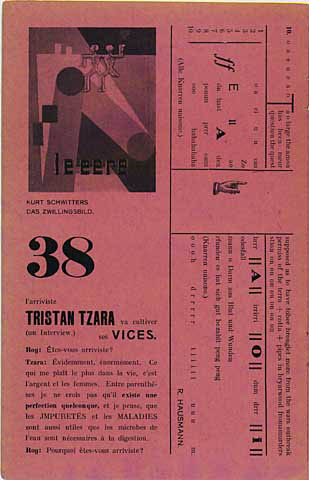
I am linking two images to show how absolutely brilliant this collection is: Above is a magazine cover which Alki1 thinks was designed by Herbert Bayer in 1929 (wow! - how often does one come across something like this?); and below is a Renå Binder and Max Eichheim poster for the International Press Exhibition Pressa, held in Cologne, Germany in 1928.


Hiroshige

Not only is Ando Hiroshige a hugely important artist in his own right, but he is also to be reckoned with in terms of the influence that he and his fellow Japanese woodblock printers exerted over late 19th Century Western art & design: Hiroshige combines ideograms and imagery in his prints, often through a usage of boxes and rules as hierarchical aids. And it is this mastery over typographic hierarchies combined with complex imagery that was so ingeniously adapted to Western typographic systems by the likes of Alphonse Mucha, creating the typographic style of Art Nouveau. 

There are many resources showing Hiroshige's output online, but sometimes the most obvious place to look can also turn out to be the best one ;-). Although the images on wikipedia are much larger than what can be found there, nonetheless the richest image repository that I have come across has been put together in England and can be accessed from here:

I am linking the following images from the publication entitled "Famous Restaurants of the Eastern Capital" (1852/53), since these provide really good examples to Hiroshige's typographic mastery. Needless to say, this is only the very tip of the huge iceberg of what Hiroshige has to offer.


In Aedibvs Aldi

The Legacy of Aldus Manutius and his Press

What this site lacks in appearance it more than makes up for in content. A modest, bare bones html interface takes you through the life and times and the work of one of the greatest book designers and printers of all time. Very good textual descriptions as well as lots of plates showing the beautiful book pages created at the Aldine Press.


Neville Brody

A really good collection of Neville Brody's output put together by Peter Gabor can be found here:

I am really happy to have found this, since decent sized online reproductions of Brody's work are not too easy to come across. In fact, I had a very hard time back when I was putting together the course website. So, this is really great! I am only linking one out of a huge collection of very well selected images - definitely check out the rest!


Panteek: Antique Prints


A huge selection, everything from biological illustrations to fashion plates:
http://www.panteek.com/index.htm


Printing in England from William Caxton to Christopher Barker

The page of an exhibition held in England in 1977! Gives lots of information on the era. Some nice images also, but mostly text:

The images below are William Gilbert's "De magnete", printed in London by Petrus Short in 1600 (top), Galen's and "De temperamentis, et de inaequalia intemperie" from 1521 (middle), and James Pilkington's "A godlie exposition upon certaine chapters of Nehemiah", printed in Cambridge by Thomas Thomas in 1585 (bottom).


The Wenceslaus Hollar Digital Collection

Huge archive of etchings of the artist, covers a huge range from costumes to architecture to maps and title pages. The image quality of quite a few of the reproductions is not the greatest, unfortunately.

http://link.library.utoronto.ca/hollar/


John Maeda interviews Paul Rand


http://acg.media.mit.edu/events/rand/ideamag.html. While John Maeda's reputation is somewhat tarnished these days, Paul Rand's still shines as bright as the sun.


Paper, Leather, Clay & Stone

This is a really great online exhibition, put together by Cornell University, which takes you through the history of writing based upon the materials that were used for such a purpose. The index page is built as a very simple to navigate table which takes you to all of the illustrated sub-sections which also provide short but excellent explanatory texts.

Cuneiform tablets. Produced in the city-states of Ur, Erech, and Babylon. Late third and early second millenia bce.


"The Book of the Dead". Egypt, ca. 332-30 BCE.


"The Jade book". Ch'ing Shêng-tsu, Emperor of China. Reigned 1662-1722.


 Denis Diderot. 1713-1784. "Encyclopédie, ou, Dictionnaire raisonné des sciences, des arts, et des métiers". Paris: Braisson and others, 1751-1780.

....................................................................................................................................
   

The Prelinger Archive


The famous Prelinger archive is a collection of over 2000 vintage videos which are opensourced, so they can be used for teaching purposes, also in studio art classes:
http://www.archive.org/details/prelinger


Paula Scher gets serious


A great video on the TED website by Paula Scher from Pentagram about solemn and serious design.

"Paula Scher looks back at a life in design (she's done album covers, books, the Citibank logo ...) and pinpoints the moment when she started really having fun. Look for gorgeous designs and images from her legendary career."

Again, the video is here.


Vintage ads, and all sorts of other modernist ephemera...

... is brought to us by clotho98: A truly great repository of in-your-face modernist advertising design. I absolutely love it! clotho's interests also cover Victoriana and Art Deco. She has separated her collection into various categories and I will definitely be tackling some of the others later. For now, get a load of this lot:


Mehmed Siyah Qalem

China, chinoiserie and Painting in Turkestan under the Timurids, ca. 1400: http://www.ee.bilkent.edu.tr/~history/turkis.html


I love the miniatures of Mehmed Siyah Qalem, or Mehmed of the Black Pen. Although Mehmed Siyah Qalem was a Turk from Central Asia his work is very strongly inspired by Chinese art, which was imported into Turkestan by the Mongol invasions at the times, as well as by the strong trade links between Eastern and Western Asia.
   

University of Toronto: Anatomia Collection

Very nice collection of Anatomical Illustrations, can be accessed from here:
http://link.library.utoronto.ca/anatomia/application/index.cfm.

The three plates below are from "Traité complet de l'anatomie de l'homme" by Marc Jean Bourgery (1797-1849). The book was published in Paris in 1831-1854. However, this is by no means the only book to be found here: The collection is huge, with ninety-five individual titles represented, ranging in date from 1522 to 1867, one more beautiful than the other.


Dada Periodicals

A brilliant collection of Dada periodicals: http://sdrc.lib.uiowa.edu/dada/collection.html


cover for 391, by Francis Picabia.


3 Above: Merz pages by Kurt Schwitters, the central image is a centerfold from issue 8/9, which was actually designed by El Lissitzky.

Also on this site are lot of page reproductions of poetry books by Dadaist poets ranging from Eluard to Tristan Tzara; as well as pages from an exhibition catalog of Max Ernst's work (below).

Incunabula Collection


Probably the best collection of Icunabula to be found online - at least that I am aware of. Not only many superb quality images but also very good explanatory text. The collection mostly concentrates on full text pages (with relatively few images); which I find particularly fascinating since there are so many similarities that one can pinpoint between contemporary, typographically based page layouts and these stunning samples of book design.


....................................................................................................................................
   

Litterae Antiquae

A Flickr group, the description of which reads: "Officially, the phrase "littera antiqua", or "the ancient letter", was used by the humanists in the 15th century to describe a style of calligraphy or lettering found on the manuscripts which they wrongly believed had been written by the Romans. I've taken some liberties, with the phrase, but hope the spirit of the idea will remain.

This group will be dedicated to letters, carved and otherwise, from our travels around the world from the days before signs and wayfinding were populated by neon and lights."


What has come about is a really great collection of images covering antique typographic material from carved inscriptions to rare books.


....................................................................................................................................